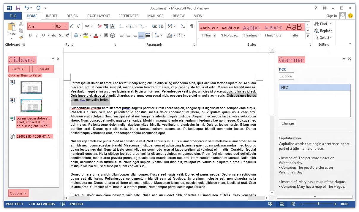
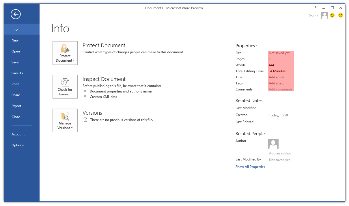
Poking around the Office 2013 Customer Preview, one thing that caught my eye immediately was the lack of ClearType font smoothing. Nearly all user interface elements use ‘greyscale’ font smoothing (as opposed to ClearType’s sub-pixel smoothing). I’ve highlighted the parts of Word 2013 that still use ClearType:
The text in cells in Excel 2013 still respects the system’s ClearType setting, and Outlook 2013 is a real mess (about half-and-half). OneNote 2013 seems to have retained ClearType in most places (outside the ribbon control).
Continue reading “Office 2013: Further evidence of the demise of ClearType?”